Let’s be real for a second: ugly notes don’t get read. I know it sounds superficial, but it’s true. You can have the most important information in the world, but if it’s displayed in boring Times New Roman on a bland white background, people’s eyes are just going to glaze right over it.
Think about the last time you actually paid attention to one of those generic WordPress admin notices. You know, the ones that look like they were designed in 1999? Yeah, exactly. Visual design matters, especially when you’re competing for attention in a busy dashboard.
In this guide, I’m going to show you how to create dashboard notes that are not just functional, but actually beautiful—notes that people want to read, notes that communicate priority through color, notes that match your brand. Let’s make your WordPress dashboard gorgeous!
Why Custom Styling Isn’t Just “Nice to Have”
Before we dive into the how-to, let me convince you that this actually matters. Custom styling isn’t vanity—it’s psychology.
The Science of Visual Hierarchy
Your brain processes visual information way faster than text. When you see a bright red note, your brain immediately goes “hey, pay attention to this!” before you’ve even read a single word. That’s not an accident—it’s millions of years of evolution telling you that red means “important, possibly dangerous, definitely needs attention.”
💡 Fun Fact: Studies show that color increases brand recognition by up to 80% and improves reading comprehension and learning by 55-78%. If it works for brands, it works for your dashboard notes too!
The Practical Benefits
Beyond the psychology, custom styling gives you:
- Instant Priority Communication: Red = urgent, Yellow = important, Blue = informational, Green = positive
- Brand Consistency: Match your company colors and feel professional
- Better Scanability: Find what you need at a glance
- Reduced Cognitive Load: Your brain doesn’t have to work as hard to process organized, well-styled information
- Emotional Impact: The right colors can motivate, calm, or energize your team
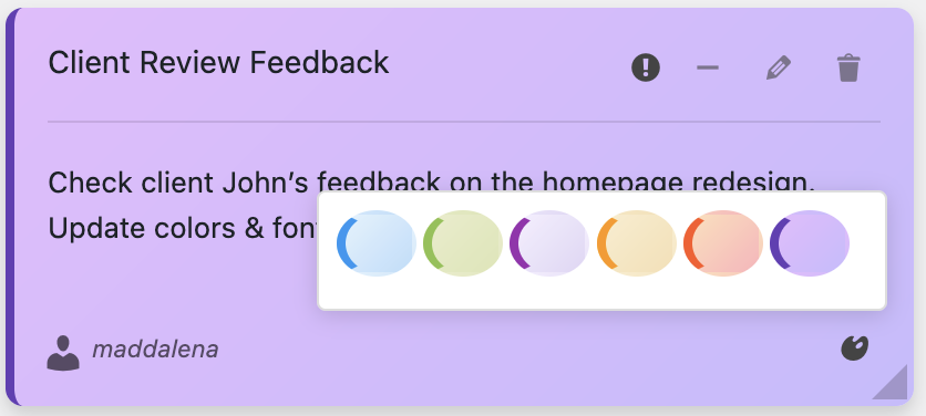
The Easy Way: Dashboard Quick Notes Color System
Alright, let’s talk solutions. You could write custom CSS for every note you create (and I’ll show you how later). But why make your life harder than it needs to be? Dashboard Quick Notes comes with a beautiful, pre-designed color system that just works out of the box.
Built-In Color Schemes
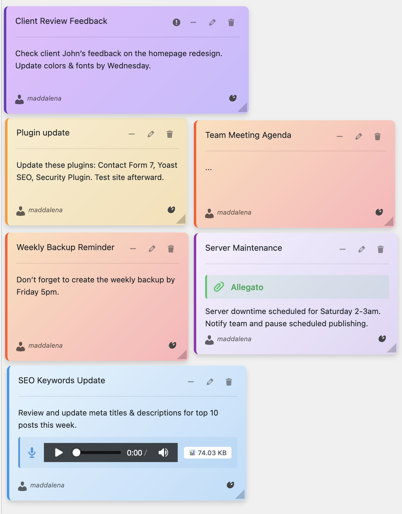
Dashboard Quick Notes includes multiple gorgeous color schemes. Let me show you what’s possible:
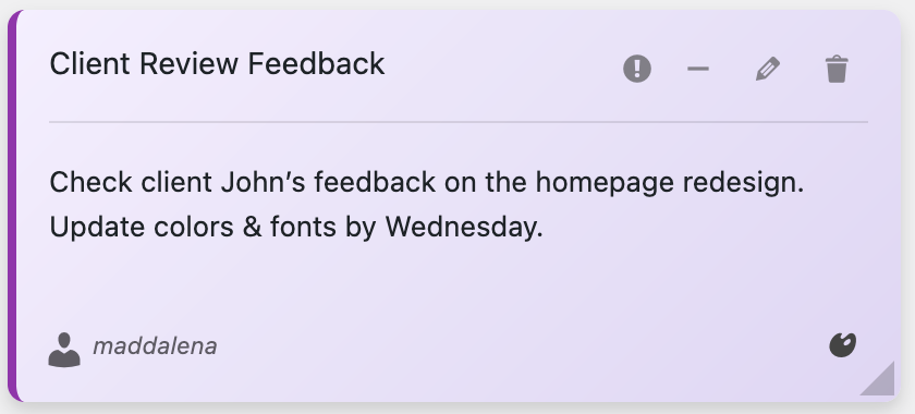
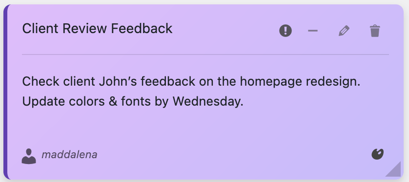
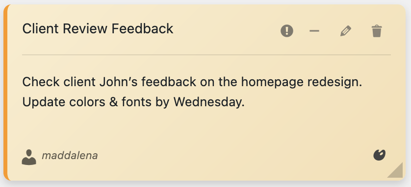
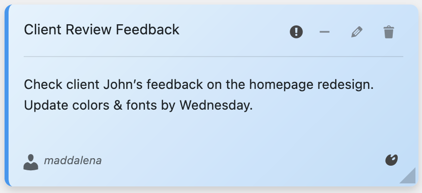
Each color tells a story:
🌸 Pink/Rose: Perfect for creative reminders, design feedback, or friendly team messages. It’s approachable and energetic.
💜 Violet/Purple: Great for premium features, special announcements, or anything that needs a touch of elegance. Purple screams “this is important AND special.”
💛 Yellow/Gold: The classic “attention needed” color. Use it for important (but not emergency) reminders. It’s urgent without being alarming.
💙 Light Blue: Calm, informational, trustworthy. Perfect for helpful tips, documentation links, or FYI messages.
💚 Green: Positive updates, completed tasks, success messages. Green makes people feel good—use that power!
⚡ Pro Tip: Establish a color code system for your team and stick to it. Once people learn that yellow means “deadline approaching” and red means “urgent action needed,” they’ll process notes faster without even thinking about it.
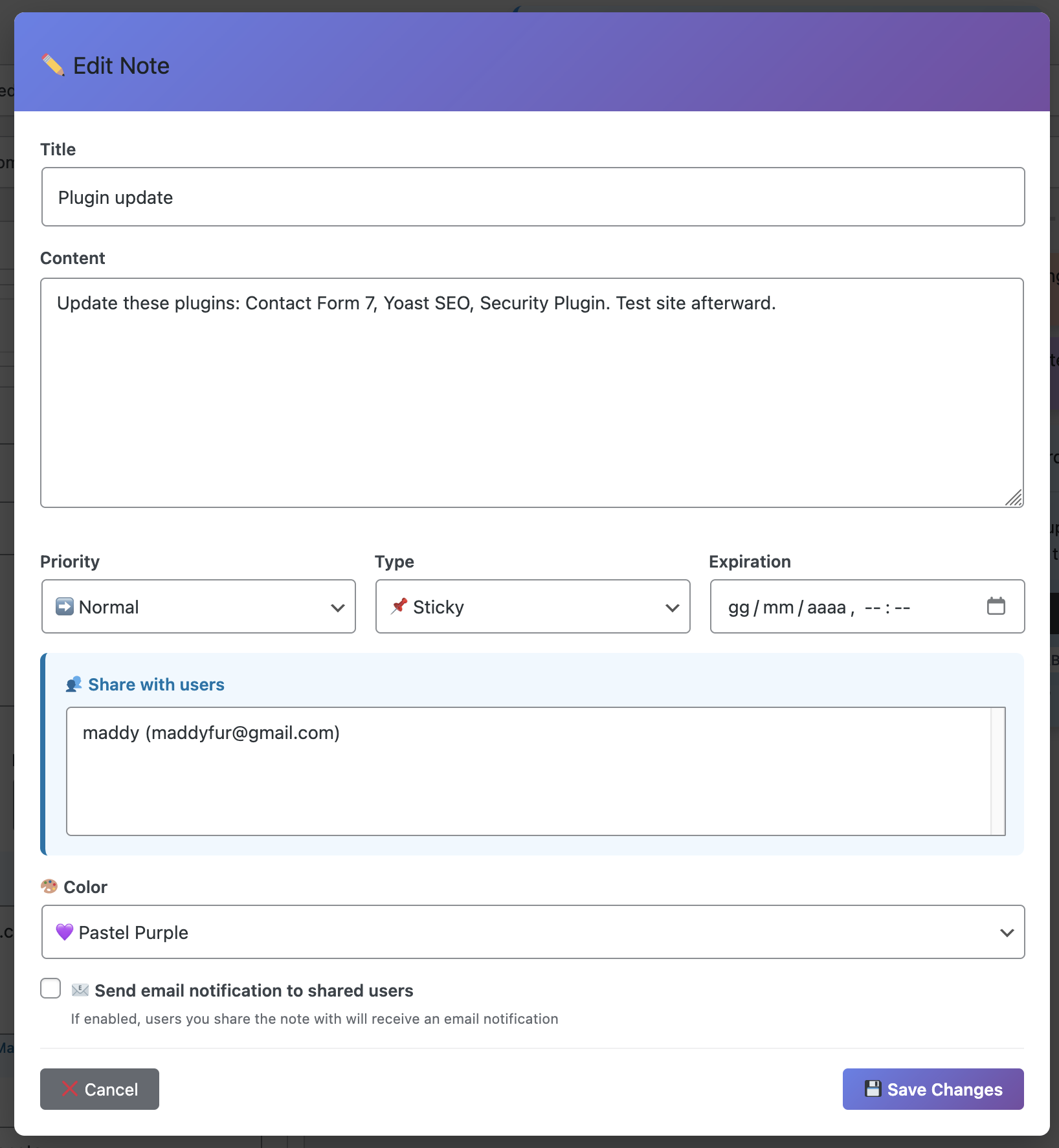
How to Apply Colors in Dashboard Quick Notes
It’s ridiculously simple:
- Open your Dashboard Quick Notes panel
- Create a new note or edit an existing one
- Look for the Color Style option
- Pick your color from the beautiful palette
- Save and admire your newly gorgeous note!
Seriously, it takes like 3 seconds. No coding, no CSS files, no headaches.
Typography: The Unsung Hero of Note Design
Color gets all the glory, but fonts are just as important. The right typography can make your notes more readable, more professional, and more effective. The wrong fonts? They’ll make your notes look like a ransom letter.
Font Psychology 101
Different fonts communicate different things:
Sans-Serif Fonts (like Arial, Helvetica, Open Sans)
Clean, modern, professional. Great for most dashboard notes. Easy to read on screens, doesn’t tire the eyes. This is your go-to for 90% of notes.
Serif Fonts (like Times New Roman, Georgia)
Traditional, authoritative, formal. Use sparingly—maybe for policy updates or official announcements. But honestly? In a dashboard context, they usually feel outdated.
Monospace Fonts (like Courier, Monaco)
Technical, code-like, precise. Perfect for notes containing code snippets, API keys, or technical instructions.
Display Fonts (fancy, decorative fonts)
Just… no. Maybe if you’re running a design agency and want something super brand-specific. But generally? They’re hard to read and look unprofessional in a dashboard context.
Font Sizes That Actually Work
Dashboard Quick Notes gives you control over font sizes, which is way more important than you might think:
- Small (12-14px): For detailed instructions or secondary information
- Medium (16-18px): Your default—readable without being overwhelming
- Large (20-24px): For headings or super important information
- Extra Large (26px+):Use sparingly—only for emergency alerts or critical deadlines
💡 Accessibility Matters: Some people need larger fonts to read comfortably. If you have team members with visual impairments, don’t be afraid to bump up those font sizes. Readability beats aesthetics every time.
Creating a Cohesive Visual System
Random pretty colors are nice. A systematic approach is powerful. Let me show you how to create a note styling system that your whole team can understand instantly.
The Priority-Based Color System
This is my favorite approach, and it works for any type of WordPress site:
🔴 RED: Emergency/Urgent Action Required
Examples: Security breach, site down, critical bug, immediate deadline
🟠 ORANGE: High Priority
Examples: Important updates, approaching deadlines, requires attention soon
🟡 YELLOW: Medium Priority
Examples: Reminders, non-urgent tasks, helpful tips
🔵 BLUE: Informational
Examples: Documentation links, FYI messages, general announcements
🟢 GREEN: Positive/Completed
Examples: Task completed, success messages, positive updates
The Department-Based Color System
If you’re running a larger organization, consider color-coding by department:
- Blue: Development/Technical team
- Green: Content/Marketing team
- Purple: Design team
- Orange: Sales/Commerce team
- Pink: Customer Support/Community team
Team members can instantly identify which notes are relevant to them just by glancing at colors. That’s efficiency!

Advanced Styling Techniques
Ready to level up? Let’s get into some power user techniques that’ll make your notes absolutely shine.
Using Gradients and Shadows
Dashboard Quick Notes supports subtle gradients and shadows that add depth without being distracting. Think of it like adding seasoning to food—a little goes a long way.
Shadows make notes “pop” off the dashboard, creating visual separation. Gradients add sophistication. Use them together for notes that look genuinely premium.
Icons and Emojis
Here’s a controversial take: emojis in professional settings are totally fine when used strategically. A 🔥 emoji next to an urgent note? Catches the eye immediately. A ✅ next to completed tasks? Satisfying and clear.
Just don’t go overboard. This isn’t a teenage text conversation—one or two well-placed emojis per note, maximum.
Brand Color Integration
If you’re running an agency or working on a client site, match your notes to the brand colors. Dashboard Quick Notes makes this easy with customizable color options. Your clients will appreciate the attention to detail, and your dashboard will feel cohesive rather than chaotic.
Common Styling Mistakes to Avoid
I’ve seen some truly terrible note styling in my time. Let’s make sure you don’t join the hall of shame:
❌ Rainbow Chaos
Using every color just because you can. Pick 3-5 colors and stick to them. More than that and you’ve got a circus, not a dashboard.
❌ Tiny Unreadable Fonts
If people need to squint, they won’t read it. 16px minimum for body text. Period.
❌ ALL CAPS EVERYTHING
IT LOOKS LIKE YOU’RE YELLING. Use caps sparingly for emphasis, not as your default style.
❌ Low Contrast Color Combinations
Light yellow text on a white background? Might as well be invisible. Ensure there’s sufficient contrast between text and background.
❌ Ignoring Mobile/Small Screens
Some team members access the dashboard on tablets or smaller screens. Your fancy styling needs to work there too. Test your notes on different screen sizes.
⚡ Golden Rule: If your styling makes notes harder to read, it’s bad styling—no matter how pretty it looks. Function first, form second.
Quick Start: Your First Styled Note
Let’s put this into practice. Here’s how to create your first beautifully styled note in Dashboard Quick Notes:
- Install and activate Dashboard Quick Notes (grab it from XpertPlugins.com)
- Navigate to Quick Notes in your WordPress dashboard
- Click “Add New Note”
- Write your message—something important but not urgent
- Select a blue color scheme (informational)
- Choose a comfortable font size (16-18px is great)
- Add an emoji if it feels right (maybe 💡 for tips)
- Save and check how it looks
Congratulations! You’ve just created a note that’s actually pleasant to look at. Doesn’t that feel better than generic admin notices?

Taking It Further: Seasonal and Event Styling
Want to have some fun? Adjust your note styling for seasons or special events.
- Holiday Season: Red and green notes with festive messages
- Product Launches: Brand colors that match the launch campaign
- Company Milestones: Celebratory gold or silver tones
- Summer Vibes: Bright, energetic colors to combat the vacation slowdown
It’s a small touch, but it makes your dashboard feel alive and intentional rather than static and boring.
The Bottom Line
Here’s the truth: you’re going to create dashboard notes anyway. The only question is whether they’ll be forgettable plain text blobs or beautifully designed communication tools that people actually pay attention to.
Custom styling isn’t about being fancy for fancy’s sake. It’s about respecting your team’s attention and making information easier to process. It’s about using color psychology to communicate priority. It’s about creating a dashboard environment that people enjoy working in.
Dashboard Quick Notes makes all of this effortless. No CSS coding, no design degree required—just beautiful, functional notes that get read and acted upon.
Ready to Make Your Dashboard Beautiful?
Stop settling for ugly, ignorable notes. Create dashboard communications that actually get noticed.
Get Dashboard Quick Notes Now →
Your WordPress dashboard doesn’t have to look like it’s stuck in 2005. Give it the visual upgrade it deserves. Your team (and your eyes) will thank you.
Now go forth and create some gorgeous notes! 🎨